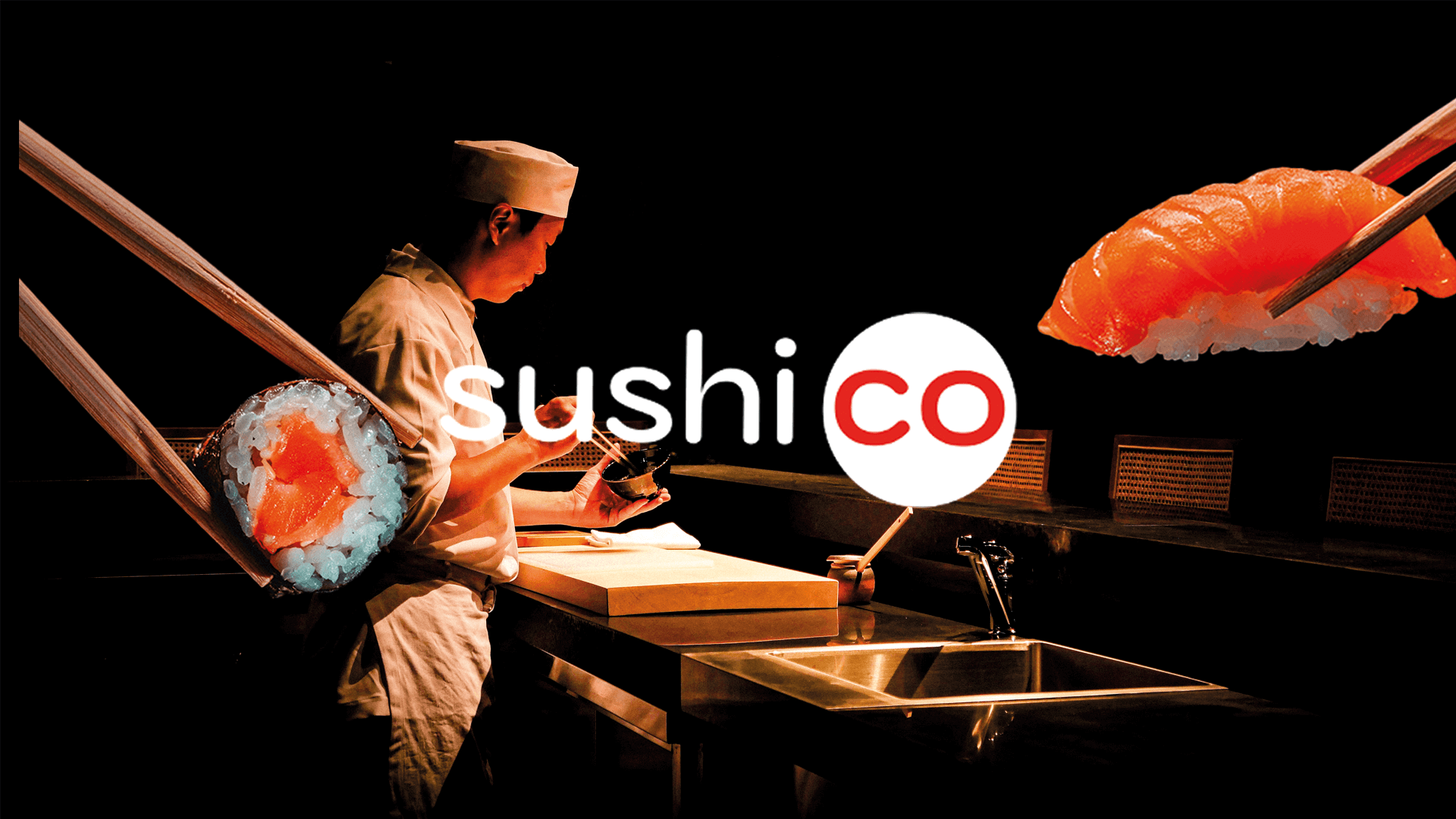
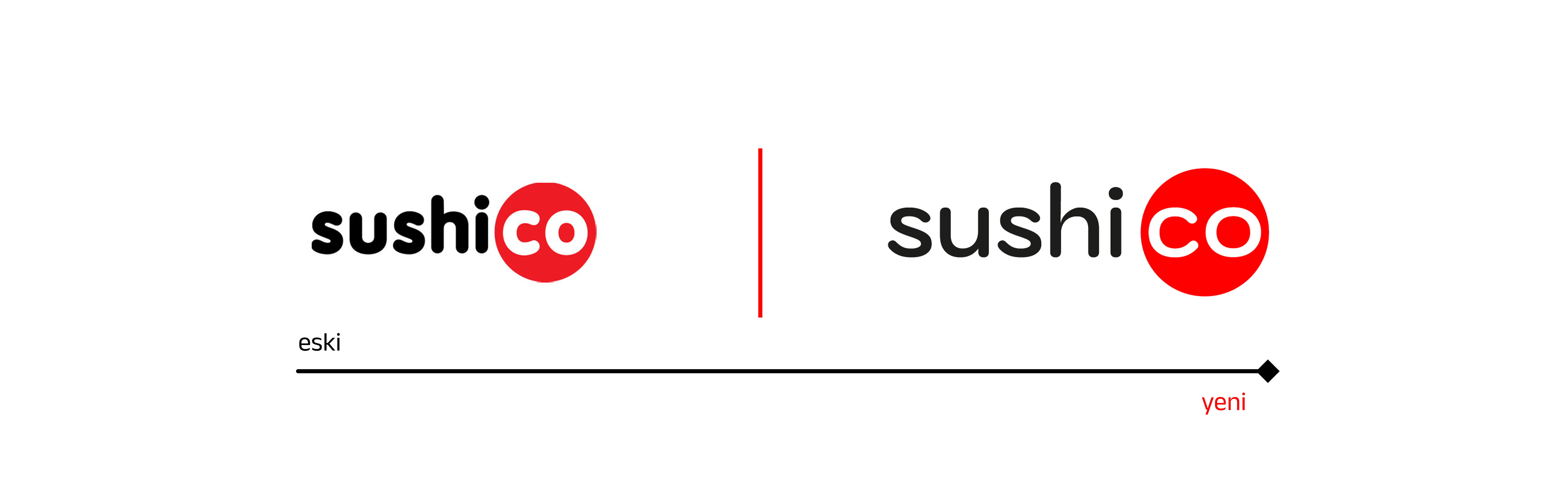
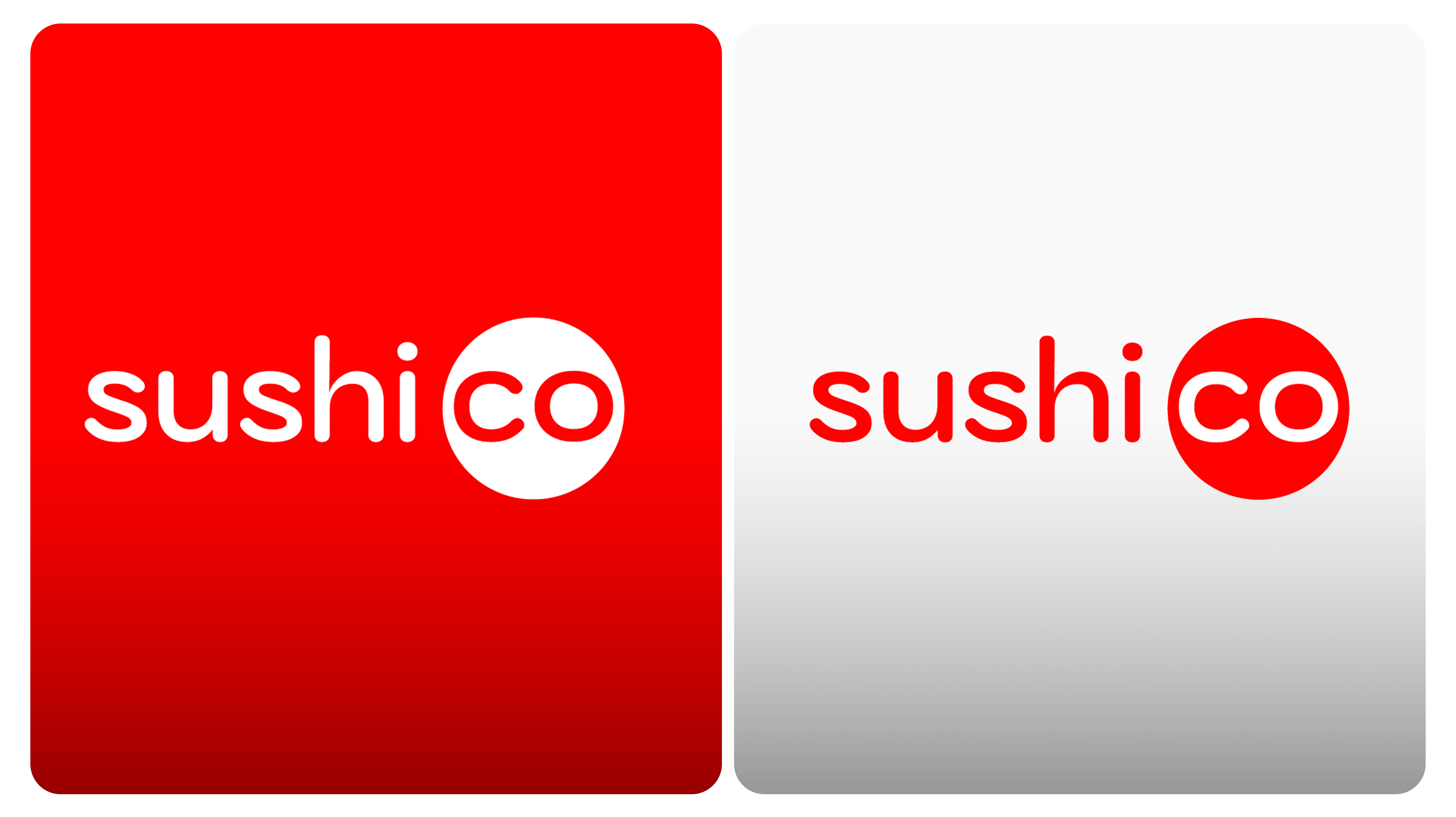
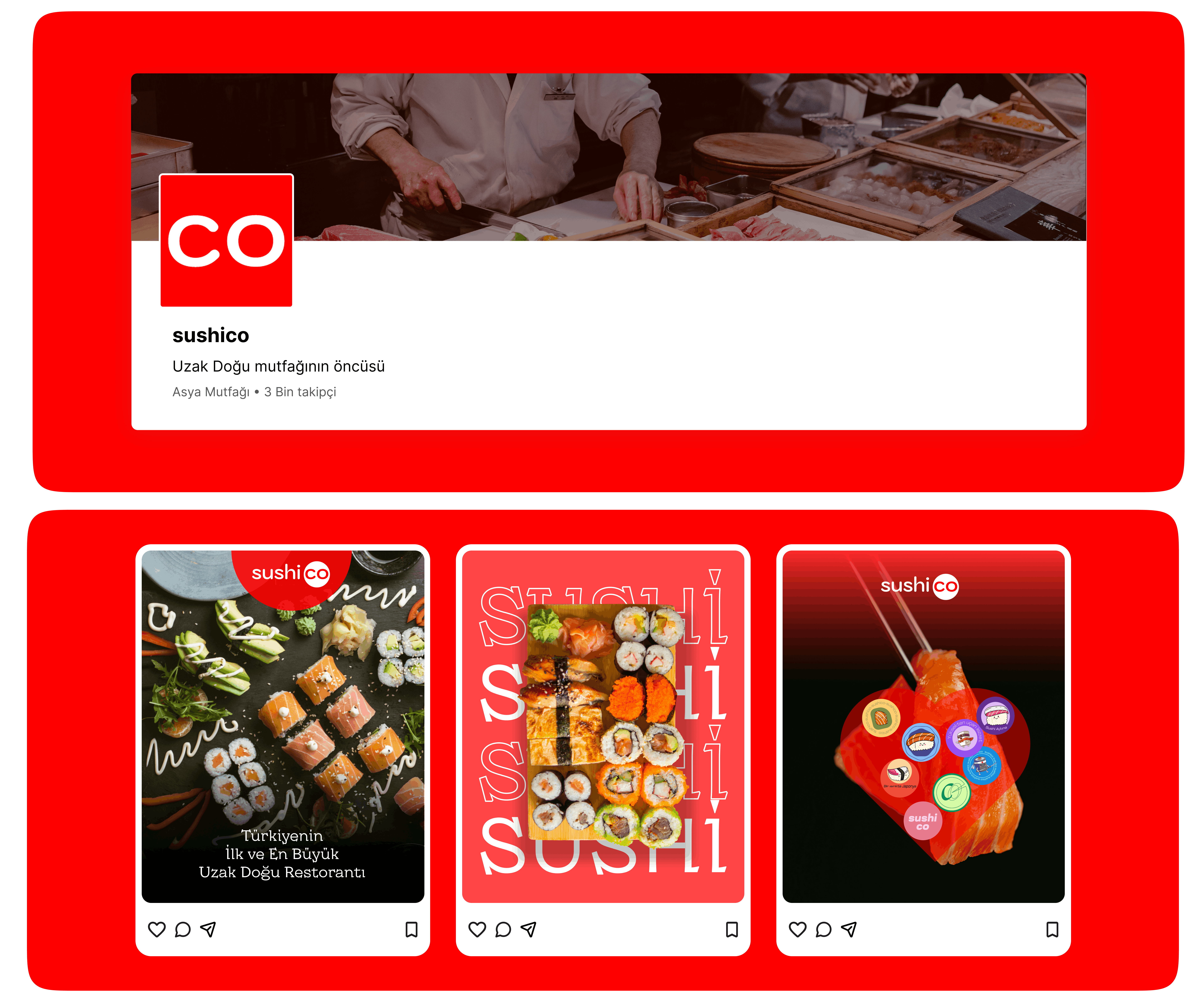
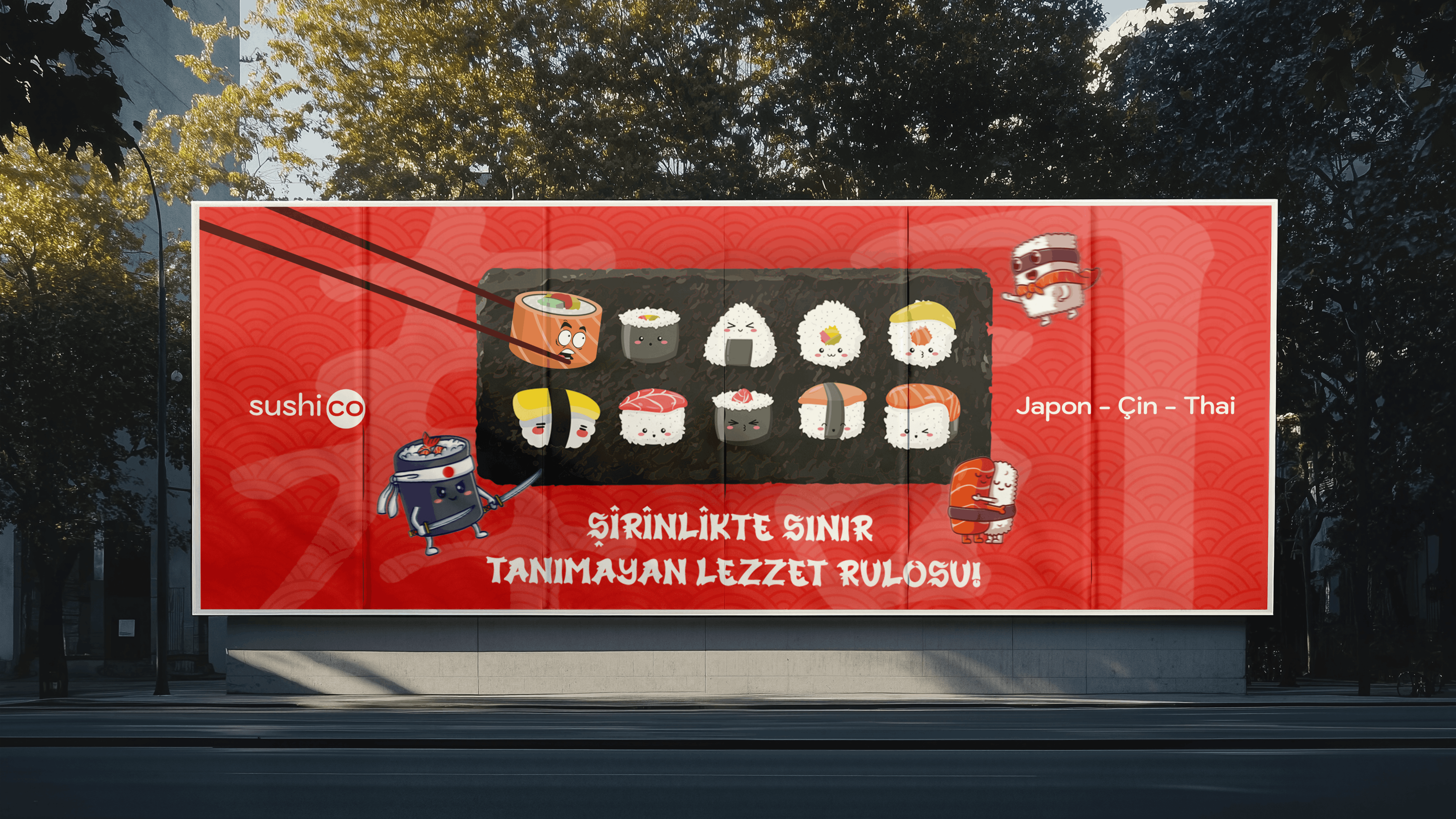
Sushico’nun branding çalışmasında, modern ve premium bir marka kimliği oluşturuldu. Yeni tasarım dili, Asya mutfağının zarafetini çağdaş ve minimal bir görsel yapı ile buluşturarak markaya taze bir kimlik kazandırıyor. Logo, eski tombul karakterlerin yerine sade ve dengeli tipografiyle yenilendi, kırmızı “co” dairesi ise daha estetik ve dikkat çekici hale getirildi. Renk paleti, tipografi ve ambalajda yapılan bütünsel yenileme ile marka daha kurumsal, çağdaş ve tutarlı hale geldi. Minimal tasarım, dijital ve fiziksel platformlarda güçlü ve uzun vadeli bir marka deneyimi sunuyor.
ING
In Sushico’s branding overhaul, a modern and premium brand identity was created. The new design language blends the elegance of Asian cuisine with a contemporary and minimal visual style, giving the brand a fresh identity. The logo was redesigned, replacing the old rounded characters with clean, balanced typography, while the red “co” circle became more aesthetic and eye-catching. Along with updates to the color palette, typography, and packaging, the brand now appears more corporate, contemporary, and consistent. The minimal design ensures a strong, lasting brand experience across digital and physical platforms.